Polar Chart
Step 1
- To add a Polar chart in your dashboard click on Polar chart.
Step 2
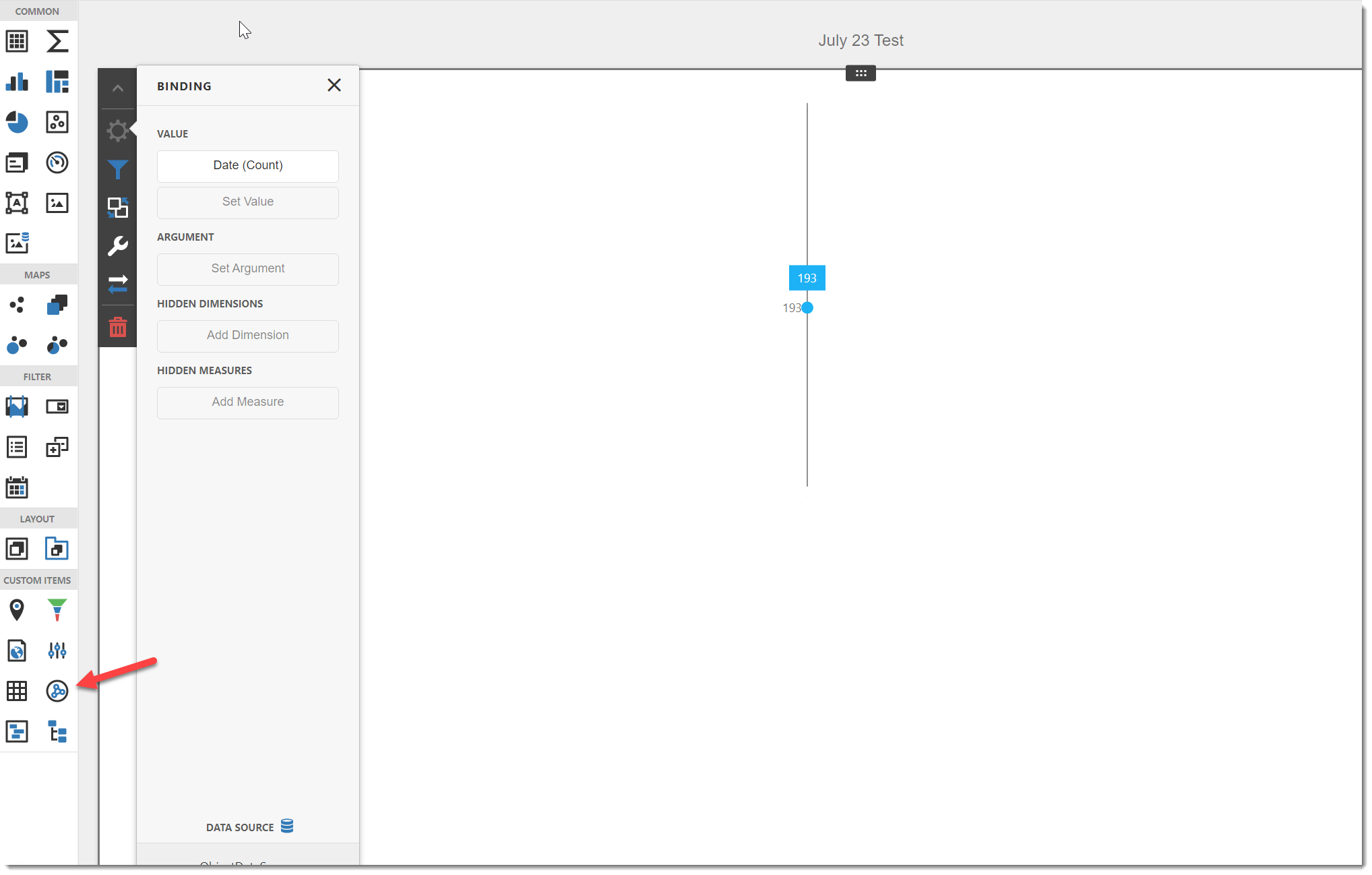
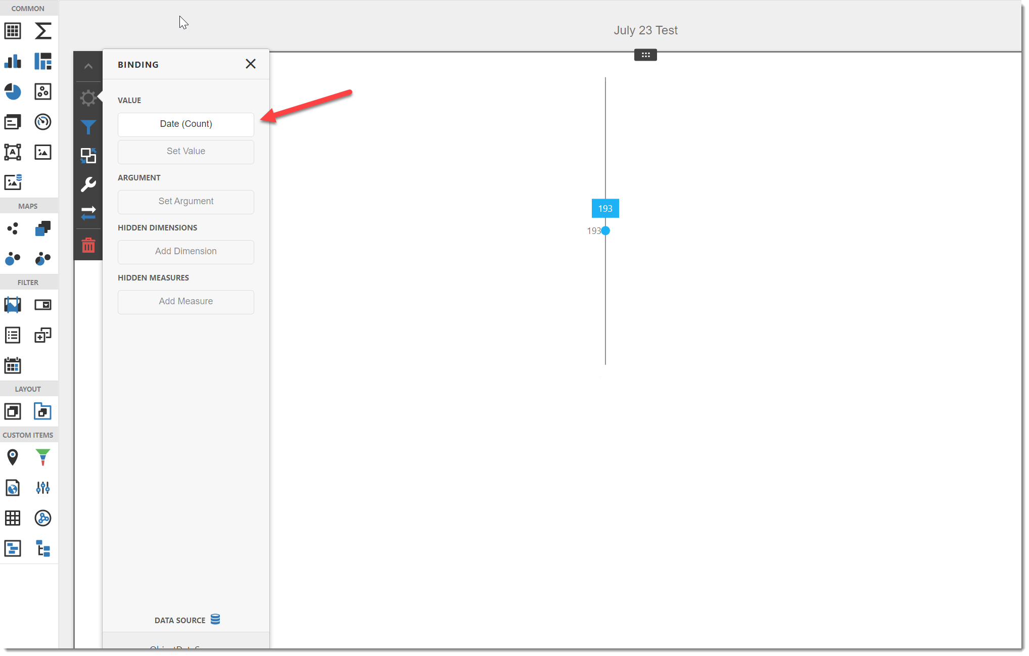
- Select a Value.
-
Any data selected here will be displayed as the base of the chart.
-
The binding menu allows you to select the summary type and specify different options for your Polar chart.
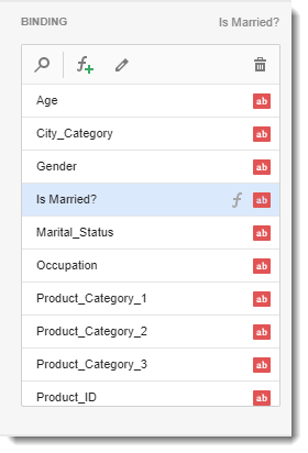
- You may need to use a calculated field. To create a calculated field use the F+ button. You will need to use SQL Queries for this.
- Option: This is the heading for the selected value. It is best to caption the visual with a variation of the question asked at the beginning of creating the dashboard.
- Calculations:
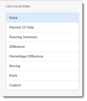
- In this section, it will automatically calculate the column by selecting one of the options.
- Filter:
- Here, you can customize and create any filter to apply to your Polar chart dashboard.
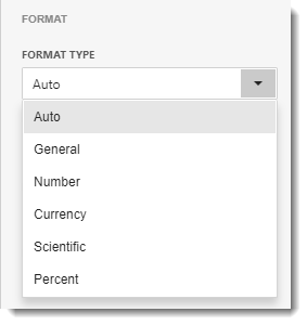
- Format:
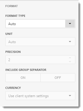
- In this section, you have the option to select the format type of the data from the drop-down menu.
Step 3
- Select an Argument.
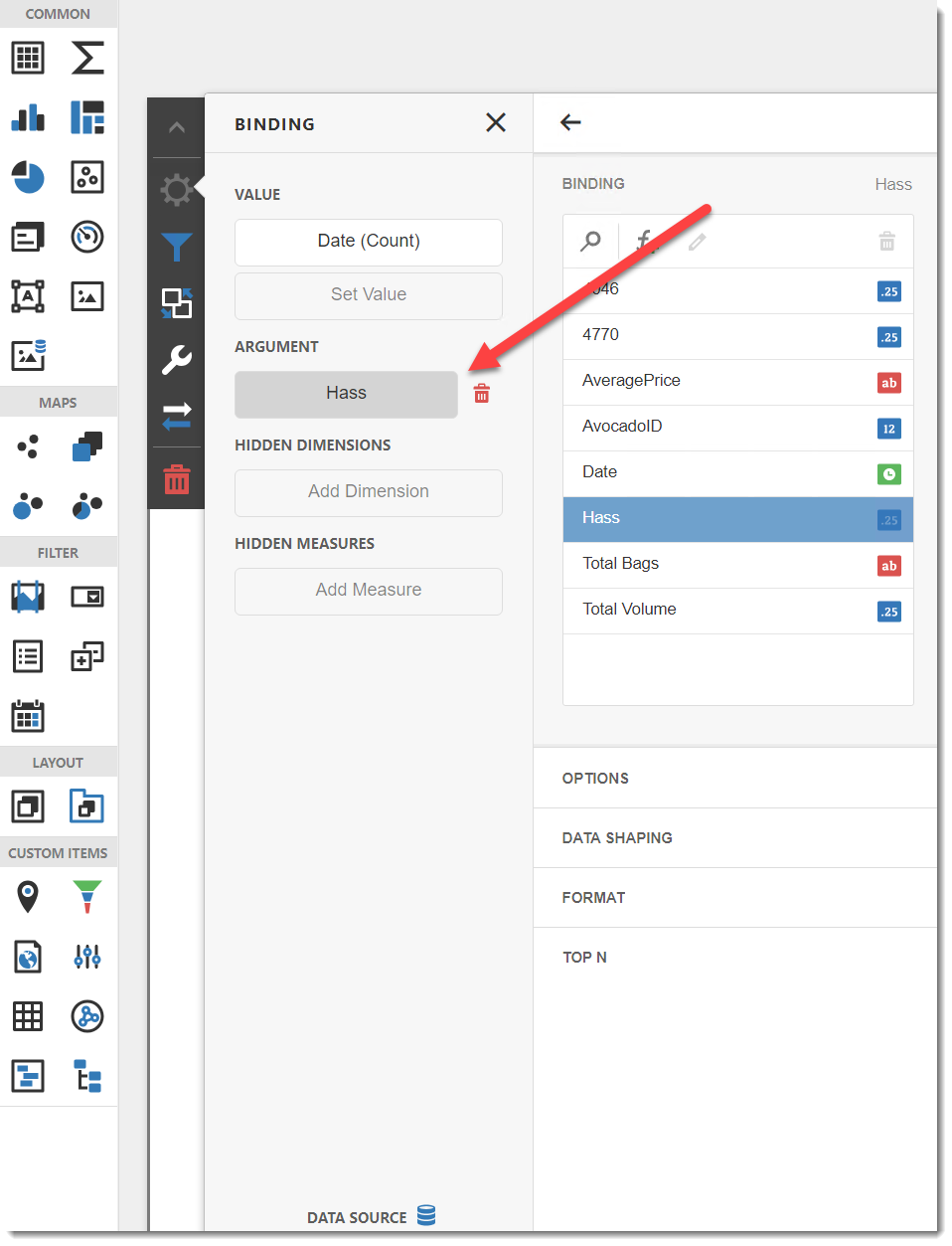
- Binding: Select the value for the information you are going to show.
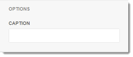
- Options
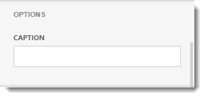
- Caption: This is the heading for the argument selected. It is best to caption the visual with a variation of the question asked at the beginning of creating the dashboard.
- Data Shaping
- In this section, you can change the sort order of the value. You can select the coloring options for the data item.
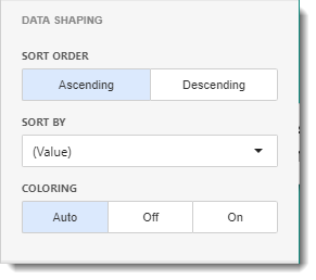
- Sort Order: You can select Ascending or Descending sort order.
- Sort By: Select the measure you want to sort this data.
- Coloring: You can set the coloring options here.
- Format
- In this section, you have the option to select the format type of the data from the drop-down menu.
- Top N
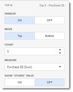
- In this section, you can customize the display number of values that correspond to the highest or lowest values of a particular measure.
- Enable this option by clicking ON.
- Mode: Specifies whether top or bottom values should be displayed.
- Count: The number of Values you want to display.
- Measure: The measure selected which the top or bottom values will be determined.
- Show "Others" Value: If enabled, all values that are not shown in the top/bottom ones will be displayed in the "Others" value.
Hidden Dimensions/ Hidden Measures
- This section can be used to display data analysis by the measure or dimensions that take part of the visualization data indirectly.
- You can use Hidden Dimensions/ Hidden Measures with the following sections:
- Data/Filtering
- Data Shaping
- Top N
- Common
If the value is already added in the binding menu, you don't need to add it in the Hidden Dimensions/Measures.
- The Polar chart will now be clearly visible on your dashboard.
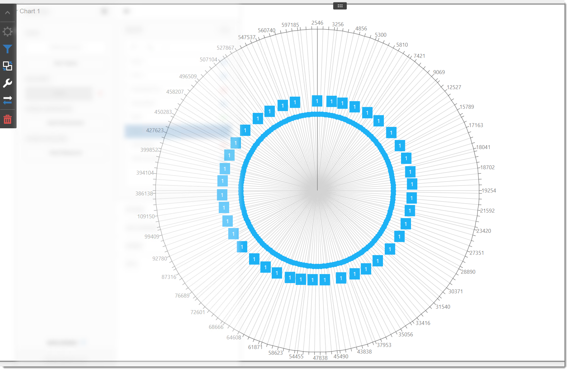
- Polar charts, also known as radar charts, are a type of chart that have a radial y-axis and a tangential x-axis. They offer support for a wide range of series types, including Bar, Line, Area, Line with Area, Combination, scatter, Bubble, Area Range, and Bar Range. Polar charts are particularly useful for representing directional data.