Share this
by Angelo Ortiz on Apr 18, 2026 7:15:00 PM
Dashboard and reporting software helps us turn raw numbers into clear action. When leaders can see performance, trends, and risk in one place, they make better decisions faster.
For enterprise teams, that matters every day. Finance needs trusted metrics. Operations needs visibility into bottlenecks. Executives need a simple view of what is on track, what is slipping, and where to act next.
The challenge is that not every tool does the same job. Some are best for interactive dashboards. Some focus on static reports. Some handle scheduled delivery of reports. And if we pick the wrong mix, we get noise instead of clarity.
In this guide, we'll explain what dashboard and reporting software does, what features matter most, how enterprise teams use it, and how IntelliFront BI software from ChristianSteven fits into a modern business intelligence environment for KPI dashboards and analytics. We'll also look at common mistakes that slow teams down, and how to avoid them.
What Dashboard And Reporting Software Does And Why It Matters
Dashboard and reporting software gives us a single view of business performance. It pulls data from one or more sources, organizes it into charts, tables, and scorecards, and makes that information easier to understand.
That sounds simple. In practice, it solves a very expensive problem: too much data and not enough clarity.
Most enterprise teams already have data. What they often lack is a fast way to turn that data into decisions. A good platform helps us:
- Track KPIs in real time
- Spot trends early
- Compare teams, regions, or time periods
- Reduce manual spreadsheet work
- Share a common source of truth
This matters because delay has a cost. If sales slips, if inventory builds, or if service levels fall, leaders need to know now, not after a month-end reporting cycle.
That is why dashboard and reporting software sits at the center of modern BI. It shortens the distance between data and action.
For teams that want a browser-based analytics layer, IntelliFront BI is designed to present business data through dashboards, KPI scorecards, and reporting views that support faster decisions across the organization.
The Difference Between Dashboards, Reports, And Scheduled Delivery
We should separate three related ideas because buyers often bundle them together.
Dashboards are interactive. They show live or near-real-time data in visual form. Users can filter, drill down, and explore what changed.
Reports are more fixed. They present structured information for review, analysis, or recordkeeping. A report may summarize dashboard data, but it is usually less interactive.
Scheduled delivery is different again. It is the process of sending reports automatically on a schedule. That function matters in many BI programs, but it is not the same thing as dashboard analysis.
In this text, our focus is the dashboard and reporting side: helping people see performance clearly and understand what to do next.
Core Features To Look For In Dashboard And Reporting Software
Not all dashboard and reporting software is built for enterprise use. Some products look polished in a demo, then struggle when real data, real security rules, and real users show up.
We should look for features that support daily decision-making at scale.
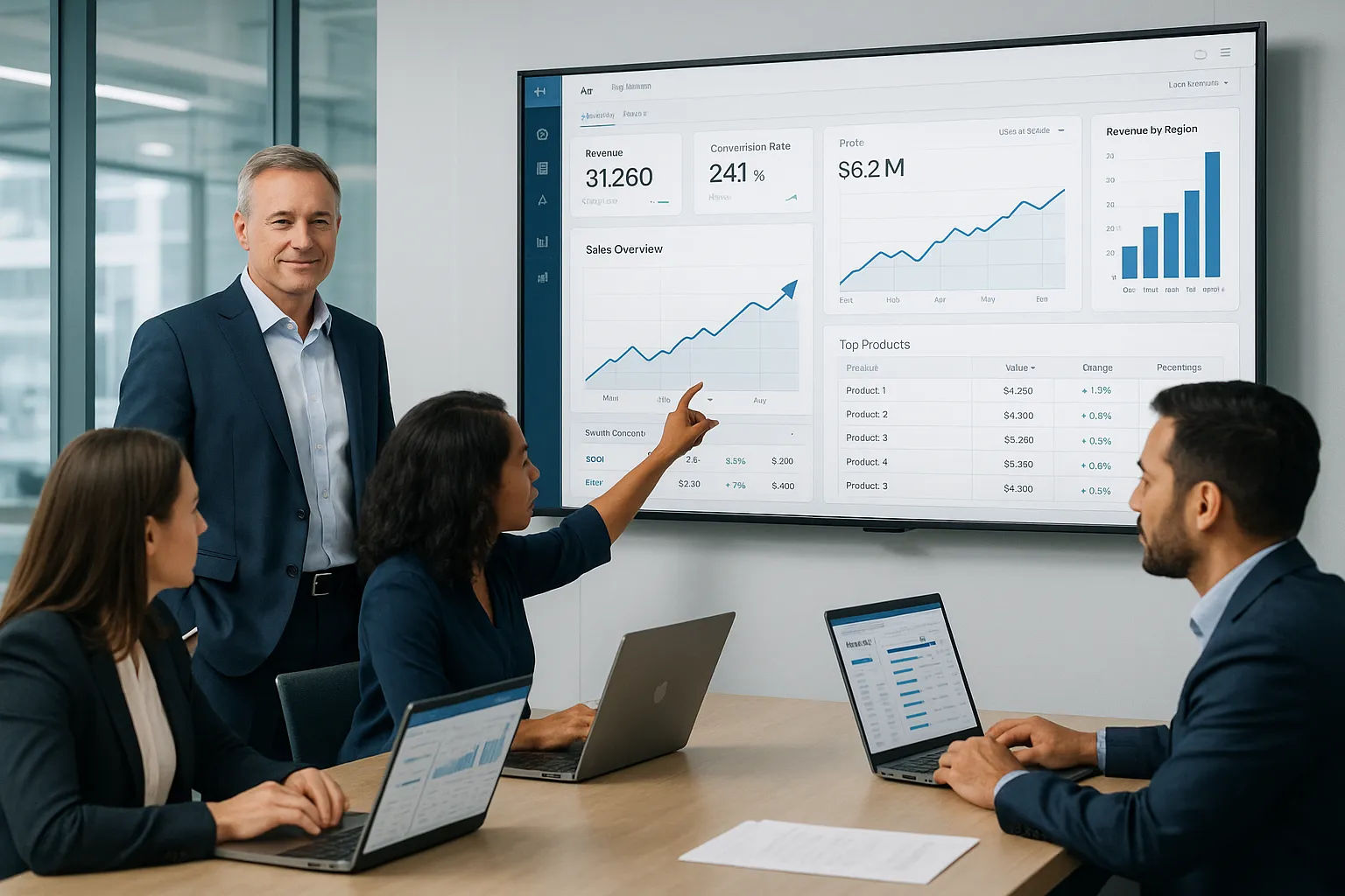
Interactive Dashboards For Real-Time Visibility
This is the feature most buyers picture first, and for good reason. Interactive dashboards help users move from "What happened?" to "Why did it happen?" quickly.
Strong dashboard and reporting software should include:
- Live or near-real-time data refresh
- Filters by region, department, period, or product
- Drill-down from summary KPIs to detail
- Custom views for different user roles
- Clear charts that do not overload the screen
Real-time visibility is especially important in operations, sales, and service teams. A dashboard that updates throughout the day can surface issues before they become quarterly surprises.
This is where IntelliFront BI is relevant. It is built to help organizations present KPI dashboards and business analytics in a way that supports quick interpretation by executives and line managers. The IntelliFront BI product page shows how it supports visual analysis and business-facing dashboard experiences.
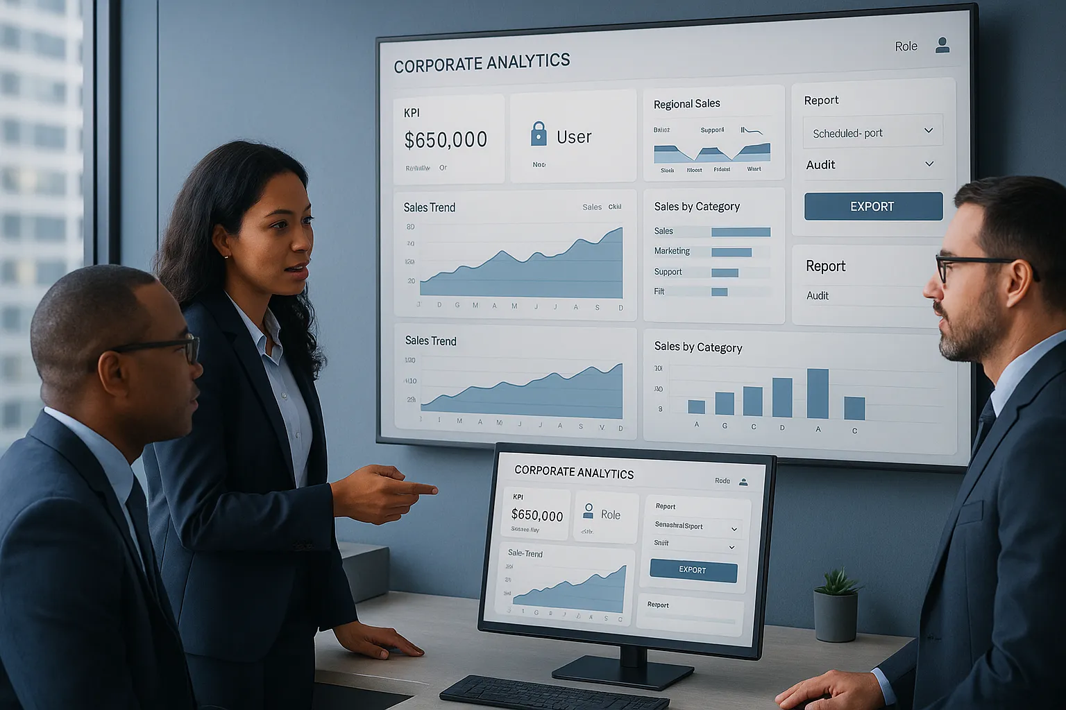
Automated Reporting, Scheduling, And Distribution
Reports still matter, even in highly visual BI environments. Teams need recurring summaries, board-ready documents, and standardized output.
When we evaluate dashboard and reporting software, we should confirm it can generate reliable reports from the same trusted data used in dashboards. That keeps metrics aligned across the business.
Useful reporting capabilities include:
- Reusable report templates
- Consistent KPI definitions
- Export options for business review
- Version control and audit visibility
Since this article focuses on dashboard and reporting software, the key point is this: dashboards support exploration, while reports support structured communication. Good platforms support both without making users rebuild logic twice.
Security, Governance, And Access Control
Enterprise BI breaks down fast if users do not trust the data or if access rules are too loose.
That is why dashboard and reporting software needs strong governance features, such as:
- Role-based access control
- Row-level or group-level visibility rules
- Central metric definitions
- Data source management
- Administrative oversight and audit trails
Security is not just an IT requirement. It affects adoption. People use dashboards more when they trust that the numbers are correct and that sensitive data is protected.
How Enterprise Teams Use Dashboard And Reporting Software
The value of dashboard and reporting software becomes obvious when we look at real business use cases. Different teams use the same data environment in very different ways.
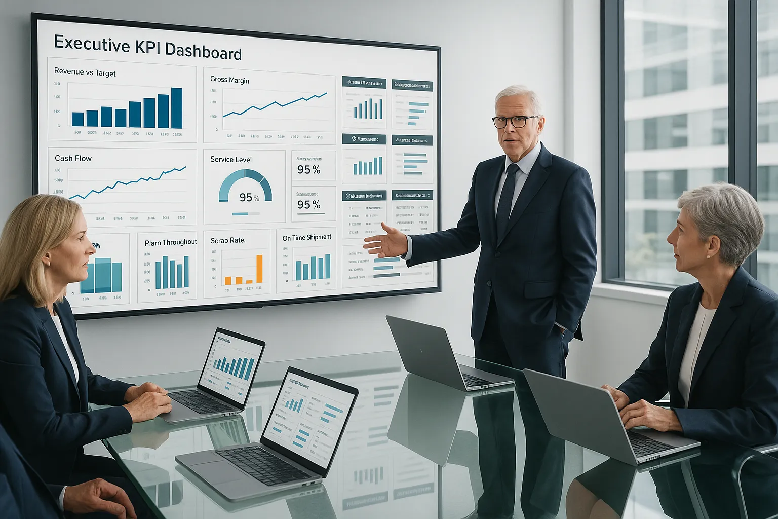
Executive Performance Monitoring
Executives need a concise view of performance. They do not want 40 tabs and a maze of filters. They want the few metrics that show whether the business is moving in the right direction.
Common executive dashboard use cases include:
- Revenue vs. target
- Gross margin trends
- Customer retention and churn
- Service-level performance
- Cash flow or backlog indicators
A strong dashboard and reporting software platform helps us present those metrics clearly, with the option to drill down when something moves outside expected range.
For example, a manufacturing leadership team may track plant throughput, scrap rate, order backlog, and on-time shipment in one executive dashboard. If on-time shipment drops, leaders can move into regional or plant-level detail and investigate the cause.
Operational And Departmental Reporting
Departments usually need more detail than the executive team.
Operations may monitor work queues, fulfillment times, inventory turns, or downtime. Finance may track budget variance, spend categories, and receivables aging. HR may review hiring funnel metrics and turnover trends. Customer support may watch response times and case resolution by team.
This is where dashboard and reporting software needs to balance clarity with depth. Users want one screen that tells them what changed, but they also need access to supporting detail.
IntelliFront BI fits this kind of use well because it is designed for business intelligence dashboards and KPI reporting across functions. In practical terms, that means one organization can build views for executives, finance managers, operations leaders, and department heads without forcing every audience into the same layout or level of detail.
Compliance, Audit, And Stakeholder Communications
Some reporting is less about daily management and more about proof, transparency, and alignment.
Healthcare teams may track quality and compliance measures. Financial services firms may monitor policy exceptions and controls. Public-sector organizations may need stakeholder-friendly dashboards that show program outcomes and spending trends.
In these settings, dashboard and reporting software helps us:
- Standardize metrics across business units
- Create visible accountability
- Support audit review with consistent data
- Communicate results to internal and external stakeholders
Clear visual reporting reduces confusion. It also reduces the back-and-forth that happens when every group builds its own spreadsheet version of the truth.
How To Choose The Right Solution For Your Organization
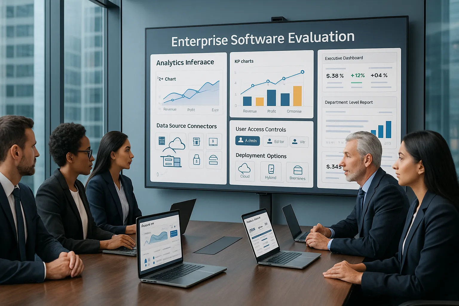
Choosing dashboard and reporting software is not just a feature checklist. We need to think about fit: our data stack, our users, our security model, and our team's ability to maintain the platform over time.
Integration With Existing BI And Data Environments
A dashboard tool is only as useful as the data it can access and present.
Before we buy, we should ask:
- What data sources does it support?
- Can it work with our current BI and warehouse environment?
- How hard is it to connect and model data?
- Can we maintain consistent KPI logic across sources?
If our organization already uses a mature BI stack, the right dashboard and reporting software should fit into that environment rather than force a rebuild.
This is part of why IntelliFront BI can be relevant for enterprise buyers. It is positioned as a business intelligence and KPI dashboard solution, and the knowledgebase gives technical teams a place to review implementation details before rollout.
Scalability, Administration, And Deployment Requirements
A tool that works for ten users may fail at one hundred or one thousand.
We should evaluate:
- User management at scale
- Performance with larger data volumes
- Administrative controls
- Cloud or on-premises fit
- Training needs for business users
The best dashboard and reporting software does not trap every change inside IT. Business users should be able to consume insights easily, while admins keep governance under control.
We should also think about rollout. If deployment is hard, adoption usually lags. If administration is too technical, dashboard growth slows after the first launch.
A practical test is to run one or two real use cases before full deployment. Try an executive KPI dashboard and one department-level reporting workflow. That shows quickly whether the platform can support both summary and detail without becoming hard to manage.
Common Challenges And How To Avoid Them
Most dashboard projects do not fail because charts are ugly. They fail because the data is messy, the purpose is unclear, or the audience is ignored.
Here are the problems we see most often with dashboard and reporting software.
Too many metrics. When every KPI is "critical," nothing is. Start with a short list of measures tied to actual business decisions.
Bad visual design. Fancy charts often hide the message. Use clear labels, simple color logic, and layouts that guide the eye.
Conflicting definitions. Revenue, margin, customer count, and backlog must mean the same thing everywhere. Create shared metric definitions early.
Slow refresh cycles. If data arrives too late, users stop checking the dashboard. Match update frequency to the decision being made.
Weak user adoption. If dashboards do not answer real questions, people go back to spreadsheets. Build around use cases, not just data availability.
A few practical ways to avoid these issues:
- Design for decisions, not decoration
- Limit each dashboard to its core purpose
- Test with real users before wider rollout
- Document KPI definitions clearly
- Review usage and improve over time
This is another reason product documentation matters. The IntelliFront BI knowledgebase can help teams reduce setup friction and answer common product questions during adoption.
And if your team needs inspiration on what effective dashboards look like, Databox's dashboard examples offers a useful range of formats across departments.
Conclusion
Dashboard and reporting software is not just a visual layer. Done well, it becomes a decision system for the business.
It helps us track KPIs, spot changes sooner, and give each team the level of insight it actually needs. Executives get fast performance views. Departments get detail. Compliance teams get consistency and traceability.
When we evaluate options, we should look beyond attractive charts. The right platform needs strong dashboarding, reliable reporting, secure access control, and a clean fit with our BI environment.
If your organization is reviewing business intelligence dashboard tools, IntelliFront BI from ChristianSteven is worth a close look for KPI dashboards, analytics visibility, and business-facing reporting. The IntelliFront BI knowledgebase is also a useful resource for teams that want to explore the platform in more detail.
The best dashboard and reporting software does one thing really well: it helps us move from raw data to clear action without wasting time in the middle.
Key Takeaways
- Dashboard and reporting software transforms raw data into clear, actionable insights that support faster business decisions by tracking KPIs and spotting trends in real time.
- Effective dashboard tools provide interactive, customizable views with live data refresh, enabling executives and teams to monitor performance and drill down into details quickly.
- Reliable reporting features, including reusable templates and scheduled delivery, ensure consistent communication and alignment across departments and stakeholders.
- Strong security and governance with role-based access and data management increase user trust and encourage wider adoption of dashboard and reporting software.
- Choosing the right dashboard and reporting software requires assessing integration with existing BI environments, scalability, ease of administration, and fit for varied organizational users.
- Avoid common pitfalls by focusing dashboards on key metrics, maintaining consistent definitions, ensuring timely data updates, and designing with user needs to maximize adoption and impact.
Frequently Asked Questions about Dashboard and Reporting Software
What is dashboard and reporting software and why is it important for enterprises?
Dashboard and reporting software consolidates business data into interactive visuals and reports, enabling enterprises to track KPIs, spot trends, and make faster, data-driven decisions with improved clarity and collaboration.
How do dashboards differ from reports and scheduled delivery in business intelligence?
Dashboards provide interactive, real-time views with drill-down and filtering features; reports are static summaries typically used for analysis or recordkeeping; scheduled delivery automates sending reports on a set schedule, reducing manual work.
What core features should I look for in dashboard and reporting software?
Key features include live, interactive dashboards with filters and drill-downs, automated and reusable reporting with consistent KPIs, plus strong security and governance like role-based access and audit trails.
How do enterprise teams use dashboard and reporting software effectively?
Executives use it for concise KPI monitoring, operations for detailed performance tracking, and compliance teams for transparent audits—each benefiting from tailored dashboards and consistent data accuracy.
Why is integration and scalability important when selecting dashboard and reporting software?
Integration ensures the software works seamlessly with existing BI systems and data sources, while scalability and easy administration support growing user bases and large data volumes without IT bottlenecks.
What common challenges do organizations face with dashboard and reporting solutions, and how can they be avoided?
Common issues include data overload, conflicting metrics, slow refreshes, and poor adoption. Avoid these by focusing dashboards on key decisions, maintaining shared KPI definitions, automating updates, and designing for real user needs.

No Comments Yet
Let us know what you think