Share this
by Bobbie Ann Grant on May 13, 2026 2:30:01 PM
Interactive data visualization dashboards help us turn crowded BI reports into clear, usable answers. Instead of staring at static charts, we can filter data, drill into outliers, and see what changed fast enough to act on it.
That matters in enterprise settings. Leaders don't just need data. They need context, speed, and confidence across operations, finance, sales, and customer performance.In this guide, we'll explain what interactive data visualization dashboards are, what makes them effective, where they deliver value, and how tools such as IntelliFront BI from ChristianSteven fit into the picture for business users who need better visibility across complex data.
What Interactive Data Visualization Dashboards Are And Why They Matter

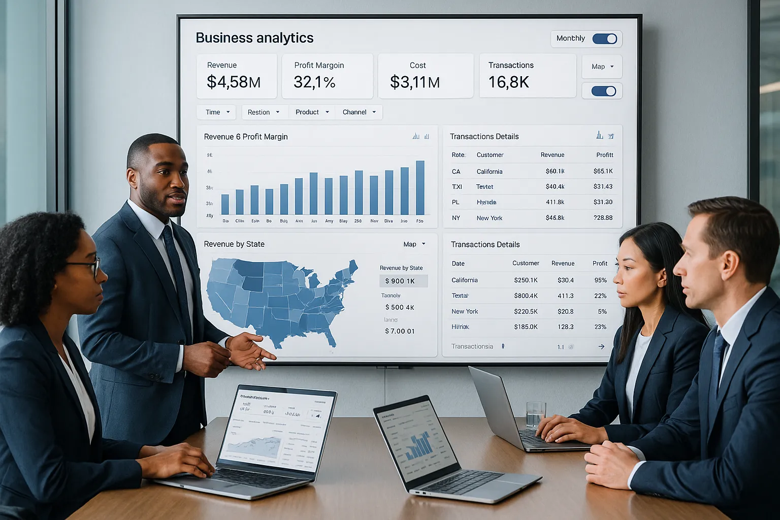
Interactive data visualization dashboards are visual BI interfaces that pull data from one or more sources and present it in charts, tables, scorecards, maps, and trend views that users can interact with. That interaction is the difference between a dashboard people glance at and one they actually use.
A static report tells us what happened. An interactive dashboard helps us ask, why did it happen, where did it happen, and who needs to respond? We can click into a region, filter by product line, compare time periods, or inspect a sudden drop in margin without waiting for someone to rebuild a report.
For enterprise teams, that speed changes how decisions get made. When finance, operations, sales, and executives all work from current views of shared metrics, meetings get shorter and actions get clearer. Research and industry reporting consistently show that visual, interactive analysis helps users detect trends and exceptions faster than spreadsheet-based review alone. Dashboards work best when they make exploration simple.
Interactive data visualization dashboards also reduce friction between analysts and business users. Instead of sending one-off requests for every slice of data, people can answer many everyday questions themselves. That improves responsiveness without lowering control.
How Interactivity Improves Business Intelligence Reporting
Interactivity improves business intelligence reporting because it turns passive consumption into active analysis. Users can move from summary to detail in seconds.
That usually includes actions such as:
- Filtering a KPI by department, region, or date range
- Drilling from enterprise totals into business units or transactions
- Switching chart views to compare trend, mix, or variance
- Highlighting exceptions to spot anomalies early
This matters when conditions change fast. A sales leader might notice a revenue dip, filter to one territory, and then drill into account mix to find whether the issue is pricing, volume, or churn. An operations manager might spot a spike in defects and isolate one plant or shift before the problem spreads.
This is where IntelliFront BI is relevant. It is built to help organizations create interactive dashboards, KPI views, and business intelligence reporting experiences that make data easier to explore and understand. ChristianSteven's IntelliFront BI knowledgebase also gives teams practical guidance on features, setup, and usage, which is useful when rolling dashboard access out to different business groups.
The Core Elements Of An Effective Interactive Dashboard
Not every dashboard deserves attention. The best interactive data visualization dashboards share a few design traits that make them easier to trust and easier to use.
First, they answer a real business question. Second, they put the most important metrics first. Third, they let us explore detail without cluttering the first screen.
Filters, Drill-Downs, And Dynamic Views
Filters are the basic control layer of interactive dashboarding. They let us narrow the view by time, region, product, business unit, channel, or any other useful dimension.
Drill-downs add structure. We can move from company-wide revenue to region, then store, then transaction level. That path helps users investigate issues without getting lost.
Dynamic views make a dashboard flexible. Instead of building a separate report for every audience, we can let users switch perspectives based on what they need. For example:
- Monthly vs quarterly performance
n- Gross margin vs revenue
- Product family vs individual SKU
- Map view vs ranked table
Done well, these controls make interactive data visualization dashboards feel practical rather than flashy. They support real decisions.
KPIs, Visual Hierarchy, And Real-Time Context
KPIs should sit where people can find them immediately. Revenue, margin, open tickets, inventory turns, claims volume, or utilization rate should be visible without scrolling through decorative charts.
Visual hierarchy matters just as much. Big numbers should signal importance. Color should highlight exceptions, not paint every chart like a traffic light exploded. Supporting detail belongs lower on the page or behind a click.
Real-time or near-real-time context is also critical when teams use dashboards for operational awareness. If the data refresh timing is unclear, trust drops. Users need to know whether they're seeing live numbers, yesterday's close, or a weekly snapshot.
Strong dashboard tools support this balance. IntelliFront BI focuses on KPI dashboards and visual analytics, which makes it a relevant option for organizations that want interactive data visualization dashboards tied to business performance rather than disconnected charts.
Common Use Cases For Enterprise Dashboarding

Enterprise dashboarding works best when it maps directly to the decisions different teams make. Interactive data visualization dashboards are not one thing for one audience. They serve different roles across the business.
Executive Performance Monitoring
Executives need a concise view of performance across the organization. They usually care about a small set of strategic KPIs:
- Revenue and margin trends
- Forecast vs actuals
- Pipeline health
- Customer retention
- Operational efficiency indicators
Interactive dashboards help them move from a board-level snapshot into the drivers behind a number. If EBITDA is off target, leaders can drill into the business unit, geography, or cost category causing the variance.
This is far more useful than flipping through static slides in a meeting. The conversation shifts from "what happened?" to "what do we do next?"
Operational And Departmental Reporting
Department leaders need detail. Operations teams track throughput, downtime, defect rates, and service levels. HR teams review headcount, turnover, and hiring funnel metrics. IT teams monitor ticket volumes, SLA compliance, and system performance.
Interactive data visualization dashboards support this kind of management because users can isolate the exact process step or team that needs attention. They can compare shifts, locations, managers, or periods without opening five separate files.
A manufacturing example makes this concrete. Suppose one plant sees higher scrap rates. A dashboard can let the team filter by line, machine, shift, and material lot. That shortens the path from issue detection to corrective action.
Customer, Sales, And Financial Analytics
Sales and finance teams often rely heavily on comparative analysis. They want to know what changed, by how much, and where.
Useful dashboard scenarios include:
- Sales by rep, region, segment, and product
- Pipeline conversion by stage
- Customer churn by cohort or contract type
- Accounts receivable aging by business unit
- Expense variance by department
- Profitability by customer or channel
Customer-facing teams also use interactive data visualization dashboards to study behavior patterns. They can compare acquisition source, renewal rates, support volume, and account growth to understand which customers are thriving and which are at risk.
For these business use cases, IntelliFront BI fits naturally because it is designed for business intelligence, KPI tracking, and dashboard reporting across teams.
Best Practices For Designing Dashboards People Actually Use

A dashboard can be technically impressive and still fail. People use dashboards that feel clear on first glance and useful on second glance.
Here are the practices we keep coming back to:
- Start with one decision. Define the exact question the dashboard helps answer.
- Design for the user role. Executives, managers, and analysts do not need the same level of detail.
- Keep the first screen simple. Show the most important KPIs and trends first.
- Use familiar visuals. Line charts, bars, tables, and maps usually beat novelty.
- Make filters obvious. If people can't find the controls, they won't explore.
- Use color with intent. Reserve strong color for alerts, risk, or performance thresholds.
- Label clearly. Vague axis names and unexplained acronyms kill trust fast.
- Support self-service. Let users answer common follow-up questions on their own.
- Test on mobile and large screens. Enterprise users check dashboards in meetings, on laptops, and on phones.
Story matters, too. Good interactive data visualization dashboards guide the eye from the headline KPI to the supporting trends and then to the underlying drivers. That sequence helps users understand a number before they react to it.
It also helps to review dashboard design guidance from established BI publishers. Looker's data visualization best practices and Qlik's dashboard resources both reinforce a simple truth: users stick with dashboards that reduce effort.
When organizations build with a platform like IntelliFront BI, they should apply the same discipline. The tool can provide the dashboard framework, but adoption still depends on relevance, clarity, and ease of use.
How Automated Scheduling And Delivery Extend Dashboard Value
Automated scheduling and delivery can extend dashboard value by making insights easier to distribute and revisit. In many enterprises, dashboards don't replace every reporting need. Some teams still need recurring outputs, snapshots, or shared views to support ongoing communication.
That said, the main value of interactive data visualization dashboards remains the user's ability to explore live information directly. We should treat automation as a complement to that experience, not the definition of it.
Reducing Manual Reporting Workflows
Manual reporting drains time. Teams copy charts into slides, export spreadsheets, and rebuild the same status packs every week. That work creates delay and introduces inconsistency.
When organizations reduce those repetitive handoffs, analysts can spend more time improving data quality, refining metrics, and helping the business interpret results. The dashboard becomes the source of truth, while recurring reporting tasks become lighter.
Supporting Secure, Timely Distribution Across Teams
Enterprises also need governance. People should see the data they are allowed to see, when they need to see it.
That requires:
- Role-based access
- Clear ownership of KPI definitions
- Consistent data refresh policies
- Controlled distribution of sensitive information
Interactive data visualization dashboards have more impact when teams trust both the numbers and the access rules around them. That trust is what drives adoption across finance, operations, sales, and leadership.
Common Mistakes To Avoid When Building Interactive Dashboards
The fastest way to waste a dashboard project is to confuse more data with better insight. We've all seen dashboards that try to show everything at once. Nobody uses them for long.
The most common mistakes include:
- Too many visuals on one page. This creates noise and hides the real story.
- No clear audience. A dashboard built for everyone usually works for no one.
- Weak KPI definitions. If teams argue over what a metric means, trust disappears.
- Poor filter design. Buried or confusing controls stop exploration.
- No drill path. Users see a problem but can't investigate it.
- Stale data. Old numbers make interactive data visualization dashboards feel unreliable.
- Bad mobile experience. Many leaders review metrics away from their desks.
- Decorative chart choices. Fancy visuals often make comparison harder, not easier.
Another common error is treating dashboard launch as the finish line. It isn't. Teams should review usage patterns, gather feedback, and remove low-value elements over time.
If adoption is low, the issue is often simple: the dashboard does not answer the questions people ask every day. Fix that first. Design polish can wait.
Conclusion
Interactive data visualization dashboards help us move from static reporting to active decision-making. They bring together KPIs, trends, and detail views in a format people can actually use.
For enterprise organizations, the payoff is clear: faster analysis, clearer accountability, and better business conversations. Executives get visibility. Department leaders get operational detail. Analysts spend less time reworking the same questions.
If we want dashboards to succeed, we need more than charts. We need clear business questions, smart interactivity, strong governance, and a design people can understand in seconds.
And for teams evaluating platforms, IntelliFront BI is worth a look as a business intelligence and dashboard solution from ChristianSteven. The IntelliFront BI knowledgebase is also a useful resource for learning how the platform supports KPI dashboards and interactive analytics in real business settings.
Key Takeaways
- Interactive data visualization dashboards transform static BI reports into dynamic tools that empower users to explore and analyze data faster and more deeply.
- Effective interactive dashboards prioritize clear business questions, highlight key KPIs upfront, and allow users to filter and drill down without clutter.
- Interactivity enables teams to quickly identify trends, anomalies, and performance drivers, improving decision-making across finance, operations, sales, and executive leadership.
- Designing dashboards for specific user roles and maintaining simple, intuitive controls increases adoption and usability in enterprise environments.
- Automated scheduling and secure distribution complement interactive dashboards by reducing manual reporting and ensuring timely access to trusted data.
- Avoid common pitfalls like overloading dashboards with visuals, weak KPI definitions, stale data, and poor mobile design to maximize dashboard engagement and impact.
Interactive Data Visualization Dashboards FAQs
What are interactive data visualization dashboards and why are they important?
Interactive data visualization dashboards are BI tools that display KPIs and metrics visually, pulling real-time data from multiple sources. They matter because they enable faster trend spotting, better decision-making, and more collaborative business analysis compared to static reports.
How does interactivity improve business intelligence reporting?
Interactivity transforms BI reporting by allowing users to filter data, drill down into specifics, and switch views instantly. This active analysis helps teams quickly identify anomalies, explore data details, and pivot strategies without relying on analysts for every query.
What features make an interactive dashboard effective for enterprise use?
Effective dashboards include intuitive filters, drill-down capabilities, and dynamic views that enable users to focus on relevant metrics. They also prioritize key KPIs with clear visual hierarchy and provide real-time data context to build user trust and support confident decisions.
In what ways do interactive dashboards support different business teams?
Interactive dashboards serve various teams by providing tailored insights: executives get strategic KPI overviews, operations track workflow metrics, and sales and finance analyze customer trends and financial performance, all enabling faster and clearer business actions.
Why is designing dashboards for user roles and clear business questions important?
Designing dashboards based on specific user roles and business questions ensures relevance and clarity. It prevents information overload, guides users efficiently, and increases adoption by making dashboards practical and easy to use rather than cluttered or confusing.
How does automated scheduling and delivery enhance the value of interactive dashboards?
Automated scheduling and delivery reduce manual reporting effort by distributing up-to-date insights securely and timely across teams. This complements live dashboard exploration by ensuring consistent, governed access to relevant reports without extra workload for analysts.


No Comments Yet
Let us know what you think